HKCR New Website - Elevating the Rugby Fan Experience
Categories :
UX STRATEGY, UI DEISGN, WEBSITE DEVELOPMENT
Client :
Hong Kong China Rugby (‘HKCR’)
Website :
www.hkrugby.com/
CHALLENGES
The former Hong Kong China Rugby website encountered significant usability and engagement issues. Users found the site difficult to navigate due to its disorganized content layout, which often led to a frustrating user experience. The branding was inconsistent, diluting the organization's identity and diminishing user trust. Additionally, the homepage lacked interactive and dynamic elements, resulting in a static and uninviting first impression that failed to capture the excitement and community spirit of rugby.
PROJECT OVERVIEW
In response to these challenges, DigiSalad embarked on a comprehensive overhaul of the HKCR website. Our mission was to transform it into a highly engaging, intuitive, and visually compelling platform that not only delivers information but also embodies the vibrant essence of rugby.
WEBSITE FEATURES
Interactive Video Content
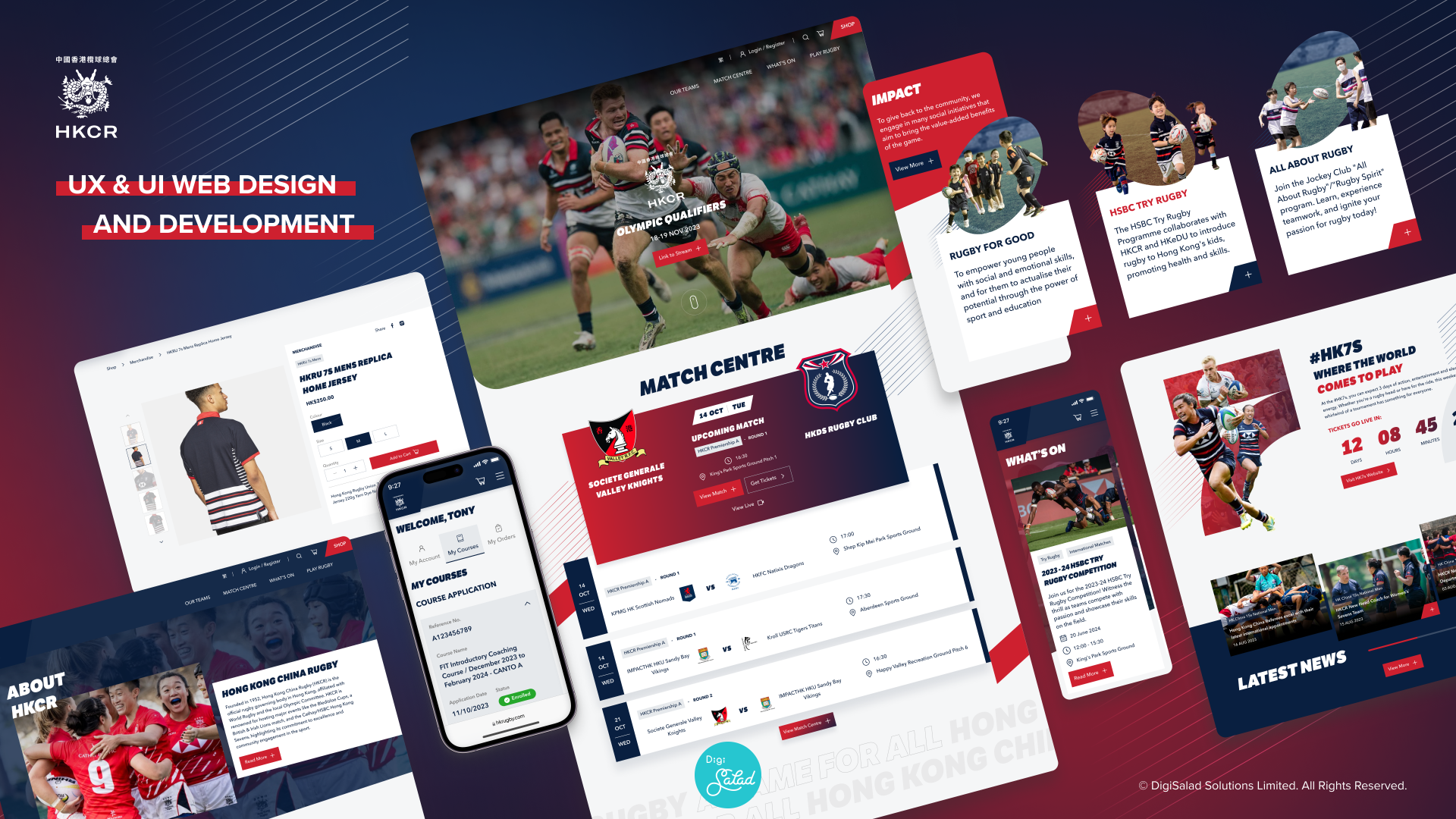
Upon entering the site, visitors are greeted with the animated opening, then comes to high-definition, action-packed video content that showcases key moments from recent matches. This feature not only captures the intensity and passion of rugby but also serves as an engaging visual narrative that draws users deeper into the site.
Streamlined Navigation
DigiSalad implemented a more intuitive and streamlined navigation structure. By simplifying the menu and organizing the content more logically, the new design minimizes user effort to find information, enhancing the overall user experience and encouraging deeper engagement with the content.
Match Centre
The redesigned Match Centre is a dynamic feature that provides fans with comprehensive, up-to-date information on games, including live scores, upcoming match schedules, and detailed analyses. This interactive hub is continuously updated to ensure that fans have immediate access to the latest data, making it an indispensable resource for rugby enthusiasts.
Countdown Clock
A new, eye-catching countdown clock feature has been integrated into the site, creating a sense of anticipation and urgency for upcoming matches. This feature is strategically positioned to catch the user's attention and effectively drive ticket sales and registrations for upcoming events.
Enhanced E-Commerce Functionality
The e-commerce section has been overhauled to provide a frictionless shopping experience. It features a clean, attractive layout, easy navigation through product categories, and quick access filters. Each product page offers high-resolution images, comprehensive descriptions, and customer reviews, enhancing user trust and encouraging purchases.
Parallax Scrolling
By introducing parallax scrolling, DigiSalad has transformed the user interaction with the website. This scrolling technique adds a layer of depth by allowing background and foreground content to move at different speeds, creating an engaging, dynamic visual experience that captivates users as they navigate through the site.
Course Registration and Tracking
The process of registering for coaching courses has been streamlined with an easy-to-use interface that allows users to fill out and submit forms online. After registration, users can track the status of their applications through a new dashboard feature, which provides updates and notifications, keeping prospective participants informed and engaged.
SOLUTIONS IMPLEMENTED BY DIGISALAD
Revamped Information Architecture
DigiSalad meticulously restructured the website's content framework to ensure that users can navigate the site with ease. The new structure is designed to intuitively guide users through the site, making it simple to locate information, access resources, and understand the full array of what HKCR offers.
Unified Branding Elements
To combat the previous inconsistency in branding, DigiSalad developed a cohesive visual identity that is reflected across all pages of the website. This unified branding approach includes consistent use of colors, fonts, and graphical elements that align with HKCR's values and enhance the brand's visibility and recognition.
Dynamic and Engaging Homepage
The homepage has been completely transformed into a dynamic interface that features animated elements, interactive content, and real-time updates. It now acts as the central hub from which users can access key areas of the site, such as match details, latest news, and merchandise offerings.
Interactive Features and Functional Enhancements
Significant enhancements have been made to the website's functionality, including the integration of a sophisticated match centre, a real-time countdown to events, and a revamped e-commerce platform. These features are designed to improve user interaction and convenience, ultimately enhancing the overall user experience and increasing engagement and sales.
CONCLUSION
Through strategic UX & UI design and the integration of advanced digital solutions, DigiSalad has successfully revitalized the Hong Kong China Rugby website. This comprehensive redesign not only improves user engagement but also supports HKCR's goals of expanding the sport's reach and fostering a stronger community of rugby fans. The new HKCR website stands as a testament to DigiSalad's commitment to delivering top-tier digital experiences that connect and inspire.
